Concept
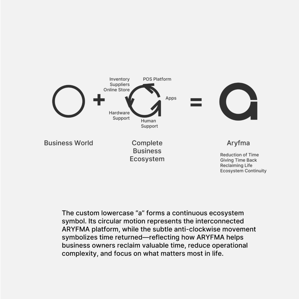
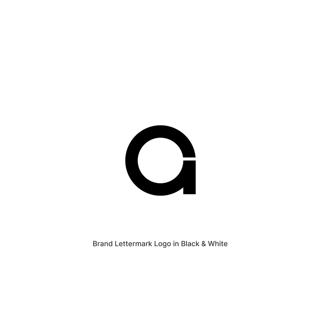
I realise this custom small letter ‘a’ not only symbolizes the common small letters used in algebra but also a spherical ecosystem that continuously loops around to help Anvar with his business and reduce the time and energy he spends. Thus helping to afford more time for himself to do things he wants to do in life.
One Connected System
ARYFMA is not simply a Point of Sale platform.
It is an ecosystem.
A connected network of software, people, suppliers, inventory, customers, and business operations working together as one intelligent system.
This concept explores that idea through a custom-designed lowercase a, transformed into a symbol of continuity, connection, and time returned.
At the heart of the identity is a circular form representing a complete and self-sustaining ecosystem.
The rounded structure symbolizes unity and interconnectedness, reflecting how every part of the ARYFMA platform works together seamlessly—from POS and inventory management to supplier integration, loyalty programs, owner applications, staff tools, hardware, and support services.
Unlike traditional software that solves a single problem, ARYFMA creates a complete environment where every component strengthens the others.
Integrated into the custom letterform is a subtle anti-clockwise circular motion.
This movement serves as a visual metaphor for one of the most meaningful outcomes described in the ARYFMA story:
Giving time back.
For many business owners, every day is spent solving problems, checking reports, monitoring staff, managing inventory, and ensuring operations continue to run smoothly.
ARYFMA reduces that burden.
The anti-clockwise motion symbolizes the reduction of operational complexity and the restoration of valuable time.
Not merely time saved.
Time returned.
Time that can be invested in family, growth, opportunity, and life beyond the business.
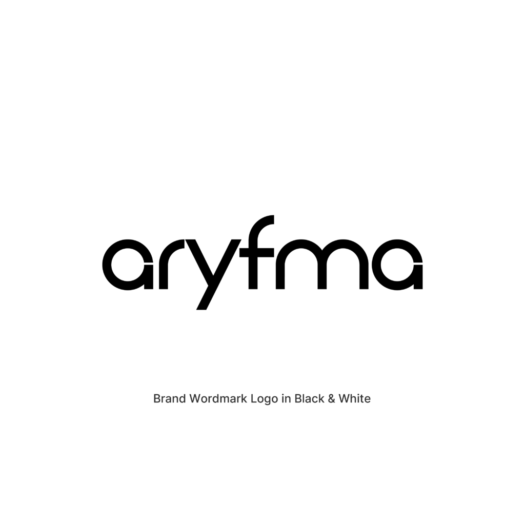
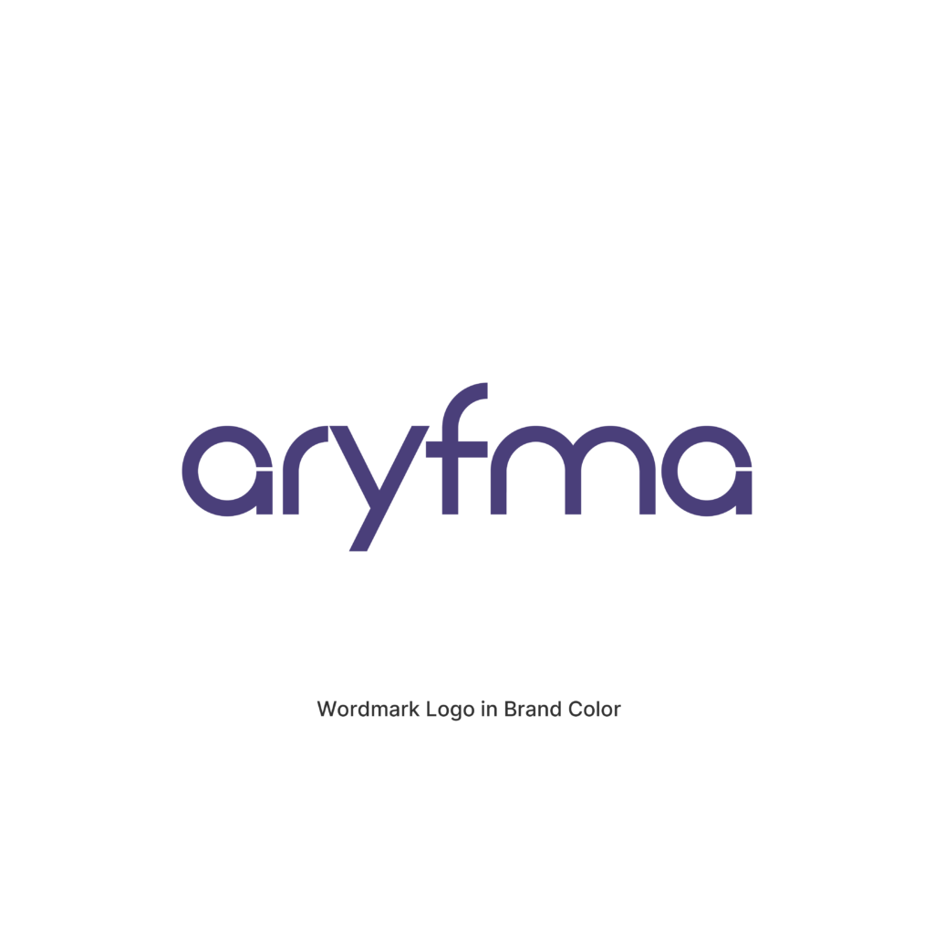
The custom wordmark is developed from the same geometric construction principles as the symbol itself. Every character is built using a consistent stroke width and rounded structure, creating a cohesive visual language that feels modern, approachable, intelligent, and highly scalable across every touchpoint.
The result is a clean and contemporary identity that communicates connection, reliability, efficiency, and long-term sustainability.
Brand Color
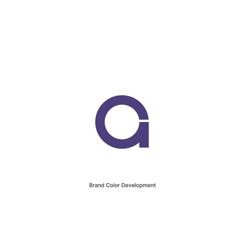
Cosmic Indigo
#4A3F7A
Inspired by clarity, confidence, and peace of mind, Cosmic Indigo represents stability within complexity.
Positioned between the worlds of technology and humanity, the color communicates trust, intelligence, security, and thoughtful innovation.
Unlike brighter technology blues that emphasize speed and disruption, Cosmic Indigo evokes a calmer and more mature confidence—reflecting ARYFMA’s role as a dependable ecosystem that quietly manages complexity behind the scenes.
The color reinforces the concept’s central theme:
Peace of Mind.
The confidence that everything is connected.
The confidence that everything is working.
The confidence that the business continues to move forward.
Strategic Meaning
- Inspired by ARYFMA’s complete business ecosystem
- Represents interconnected software, hardware, services, and people
- Uses a custom lowercase a as a symbol of unity and continuity
- Features a subtle anti-clockwise motion representing time returned
- Communicates efficiency, trust, reliability, and scalability
- Reinforces ARYFMA’s “one partner for everything” philosophy
- Positions ARYFMA as a complete business operating system rather than a standalone POS solution
Emotional Outcome
Peace of Mind
Business owners should not have to spend every moment worrying about what is happening inside their business.
They should not have to constantly check inventory, monitor staff, verify transactions, or solve operational problems.
ARYFMA exists to create confidence.
Confidence through visibility.
Confidence through connection.
Confidence through intelligent systems.
By bringing every part of the business into one connected ecosystem, ARYFMA helps owners move from constant oversight to complete clarity.
The result is not simply efficiency.
The result is peace of mind.
A business that continues to work, grow, and succeed—even when the owner is not there.
Concept C3 — Refined Ecosystem
Clarity Through Precision
As the refinement process continued, the focus shifted from exploring softness to exploring absolute clarity.
Concept C3 builds upon the same strategic foundation established in Concept C – One Connected System, but asks a different question:
What if the ecosystem were expressed with maximum precision?
This refinement removes the corner radius entirely, replacing every rounded transition with clean, intentional geometric intersections.
The result is an identity that feels sharper, more architectural, and unmistakably modern.
While the underlying idea remains unchanged, the character of the identity evolves significantly.
The continuous form now communicates structure before softness.
Precision before expression.
Confidence before decoration.
The visual language becomes quieter, cleaner, and more disciplined, allowing the concept itself to take center stage.
The circular ecosystem remains intact, preserving the original symbolism of connection, continuity, and the seamless relationship between every part of the ARYFMA platform.
Software.
Hardware.
Suppliers.
Inventory.
Staff.
Customers.
Support.
Every element continues to work together as one intelligent ecosystem.
The subtle anti-clockwise movement also remains, continuing to represent one of ARYFMA’s most meaningful promises:
Time returned.
A business owner should spend less time managing complexity and more time focusing on growth, family, and life beyond daily operations.
Concept C3 expresses that promise with a visual language that is confident, efficient, and highly intentional.
The custom wordmark has been refined using the same geometric principles, creating a unified typographic system that feels consistent across every letter.
The typography gains greater rhythm, stronger visual definition, and distinction at both small and large scales.
The overall identity feels closer to the language of contemporary software platforms—minimal, intelligent, and confidently understated.
Emotional Evolution
Clarity
Every successful business is built on clarity.
Clarity in numbers.
Clarity in decisions.
Clarity in communication.
Clarity in operations.
Concept C3 transforms the ecosystem into its most distilled expression.
Only the essential structure required to communicate connection, intelligence, and confidence.
Just as ARYFMA simplifies the complexity of running a business, the identity itself has been refined to its essential form.
The result is a mark that feels calm, decisive, and enduring.
An identity that reflects a platform built not simply to manage businesses, but to bring lasting clarity to the people who depend on it every day.
Cosmic Indigo
White