Concept
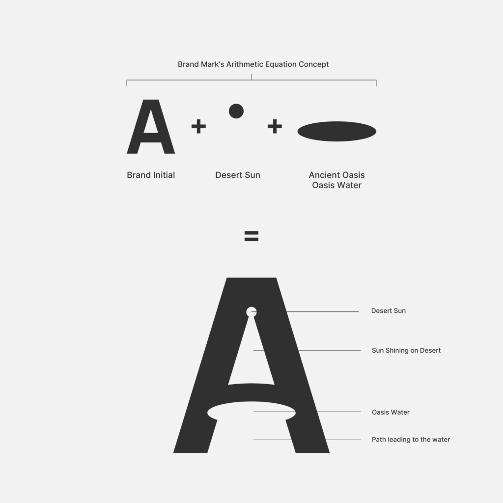
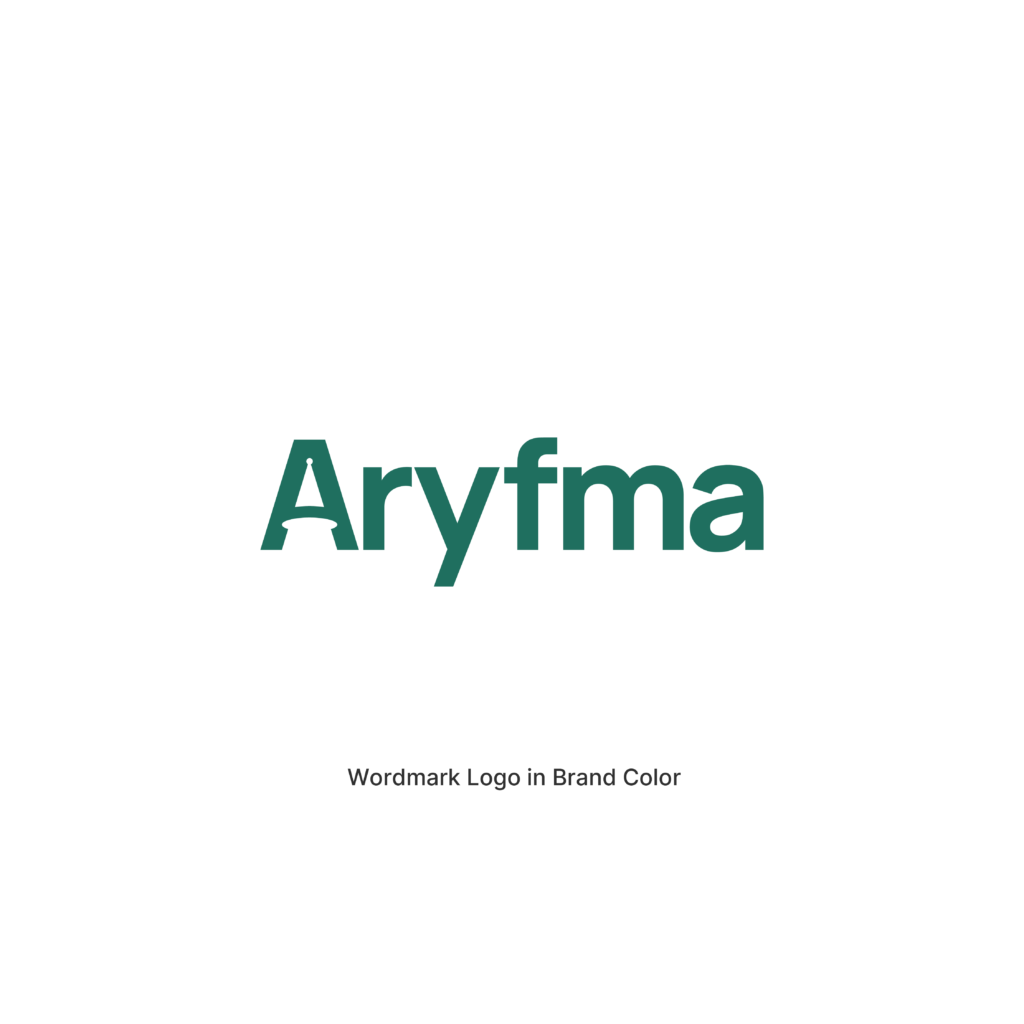
For the second exploration, I wanted to visually represent Khorezm, as it is interesting to think that Khorezm is actually an ancient oasis which can be used as a metaphor for an oasis for business. Using customised negative space within the letter ‘A’ not only forms a unique brandmark letter but also adds this interesting meaning to it. In spite of the scorching heat from the desert sun or business challenges, Aryfma exists as a wonderful oasis for businesses like Anvar’s to help him quench his thirst, rest back, and relax as it automatically takes care of everything.
From Desert to Oasis
ARYFMA was born in Khorezm, one of the world’s oldest oasis civilizations and a historic center of trade, knowledge, and prosperity.
For thousands of years, an oasis represented far more than water in the desert. It represented life, opportunity, growth, commerce, and the possibility of building a better future. Entire civilizations emerged around these rare places of abundance, transforming barren landscapes into thriving centers of human activity.
This concept draws inspiration from that powerful historical and geographical connection.
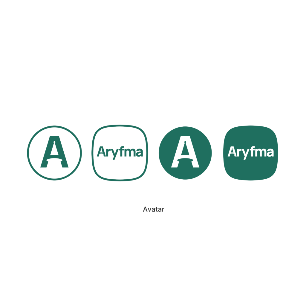
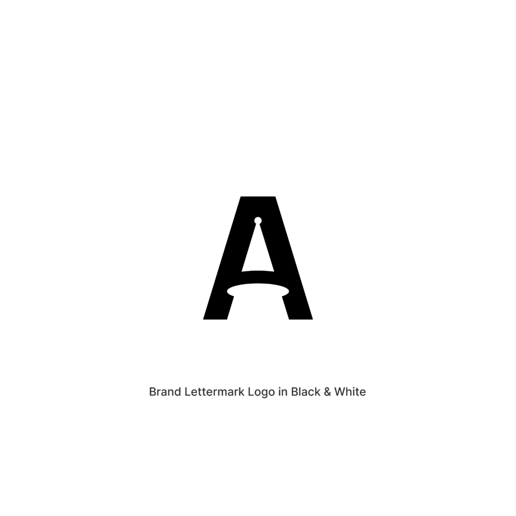
At the heart of the identity is a custom-designed A, transformed into a symbolic oasis.
The upper triangular form of the letter represents the vast desert landscapes of Central Asia and the challenges faced by business owners navigating the complexities of modern commerce.
Within the negative space of the letter lies a circular oasis, positioned as a destination rather than merely a visual element. Beneath it, a flowing path and waterway lead directly toward the oasis, creating a visual metaphor for guidance, direction, and progress.
Together, these elements transform the letter A into a journey.
A journey from uncertainty to clarity.
From effort to growth.
From complexity to prosperity.
Just as ancient travelers crossed deserts in search of life-sustaining oases, modern business owners navigate daily operational challenges in search of stability, efficiency, and long-term success.
ARYFMA becomes that destination.
The platform that helps businesses move beyond operational complexity and toward sustainable growth.
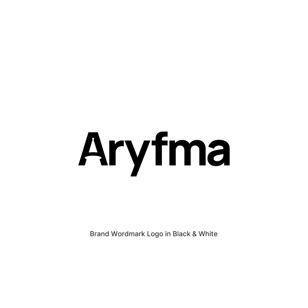
The custom wordmark is developed from the same visual language as the symbol, creating a cohesive and ownable identity system that balances heritage with modernity. The result is a mark that feels timeless, memorable, and deeply connected to the brand’s origins while remaining unmistakably digital and future-focused.
Brand Color
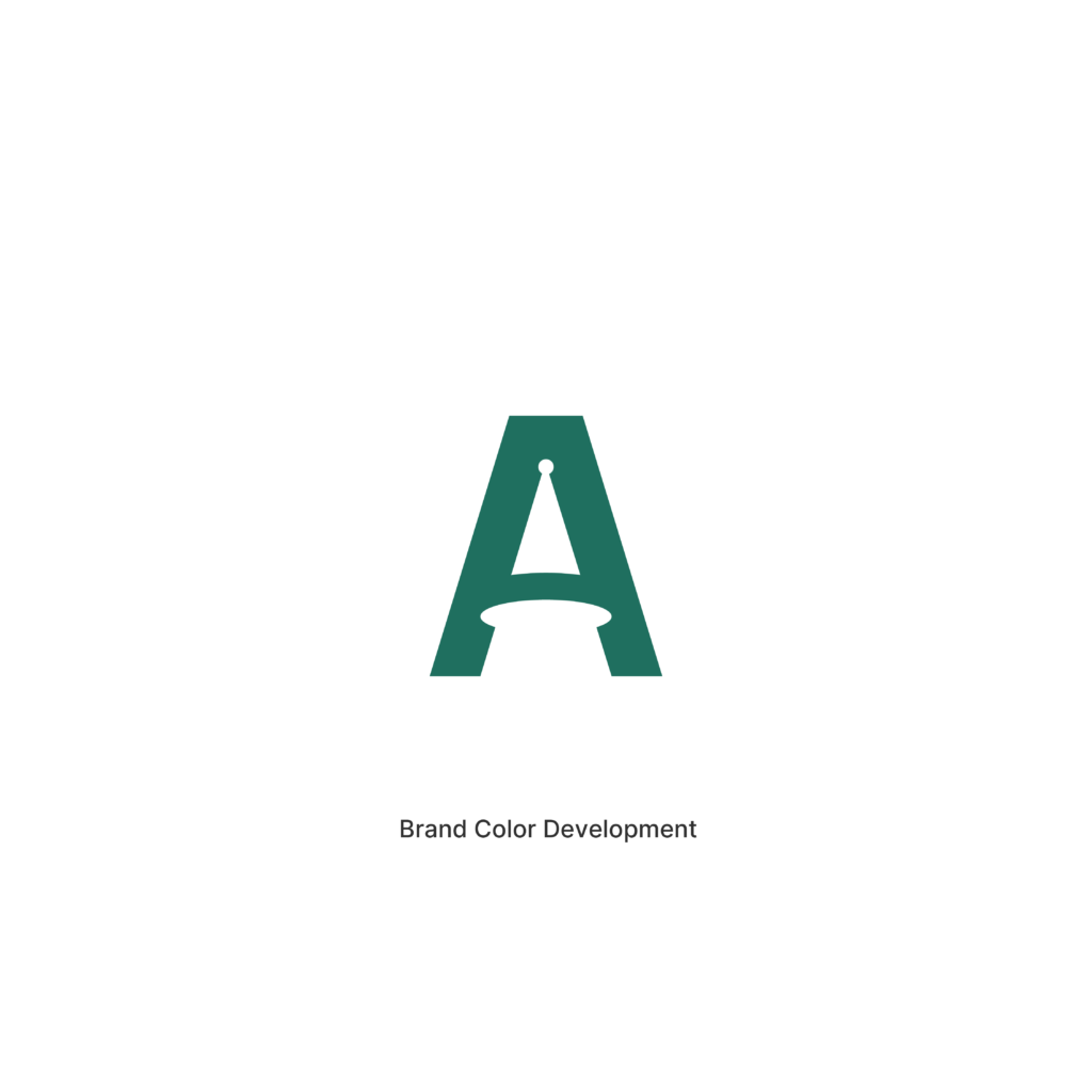
Oasis Emerald
#1F6F5F
Inspired by the fertile oasis landscapes that enabled trade and civilization to flourish throughout Khorezm, Oasis Emerald represents growth, prosperity, renewal, and long-term success.
Unlike traditional finance greens that primarily symbolize money, Oasis Emerald symbolizes something deeper:
Life.
Opportunity.
Progress.
The ability to thrive.
The color reinforces ARYFMA’s role as a platform that helps businesses grow stronger, operate more efficiently, and build lasting prosperity.
Strategic Meaning
- Inspired by the oasis civilizations of Khorezm
- Connects directly to the geographic and cultural roots of the brand
- Transforms the letter A into a symbolic destination
- Represents guidance, progress, and business growth
- Creates a memorable visual metaphor rooted in trade and prosperity
- Balances historical inspiration with modern software aesthetics
- Positions ARYFMA as a trusted partner for business transformation
Emotional Outcome
Prosperity
Prosperity begins when complexity is replaced with clarity.
When systems work together.
When business owners gain confidence in their operations.
Just as an oasis transformed the desert into a place where communities could grow and thrive, ARYFMA helps transform business challenges into opportunities for sustainable growth and long-term success.
ARYFMA is more than a tool.
It is the oasis where business finds its future.
Oasis Emerald
White