Concept
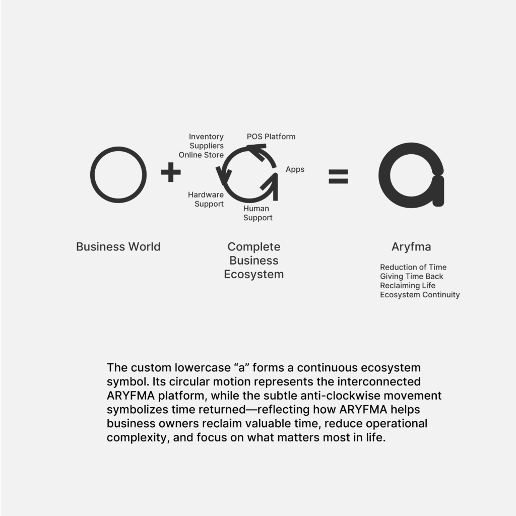
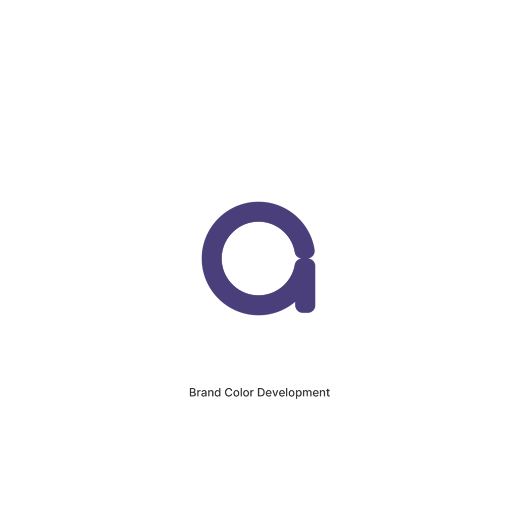
I realise this custom small letter ‘a’ not only symbolizes the common small letters used in algebra but also a spherical ecosystem that continuously loops around to help Anvar with his business and reduce the time and energy he spends. Thus helping to afford more time for himself to do things he wants to do in life.
One Connected System
ARYFMA is not simply a Point of Sale platform.
It is an ecosystem.
A connected network of software, people, suppliers, inventory, customers, and business operations working together as one intelligent system.
This concept explores that idea through a custom-designed lowercase a, transformed into a symbol of continuity, connection, and time returned.
At the heart of the identity is a circular form representing a complete and self-sustaining ecosystem.
The rounded structure symbolizes unity and interconnectedness, reflecting how every part of the ARYFMA platform works together seamlessly—from POS and inventory management to supplier integration, loyalty programs, owner applications, staff tools, hardware, and support services.
Unlike traditional software that solves a single problem, ARYFMA creates a complete environment where every component strengthens the others.
Integrated into the custom letterform is a subtle anti-clockwise circular motion.
This movement serves as a visual metaphor for one of the most meaningful outcomes described in the ARYFMA story:
Giving time back.
For many business owners, every day is spent solving problems, checking reports, monitoring staff, managing inventory, and ensuring operations continue to run smoothly.
ARYFMA reduces that burden.
The anti-clockwise motion symbolizes the reduction of operational complexity and the restoration of valuable time.
Not merely time saved.
Time returned.
Time that can be invested in family, growth, opportunity, and life beyond the business.
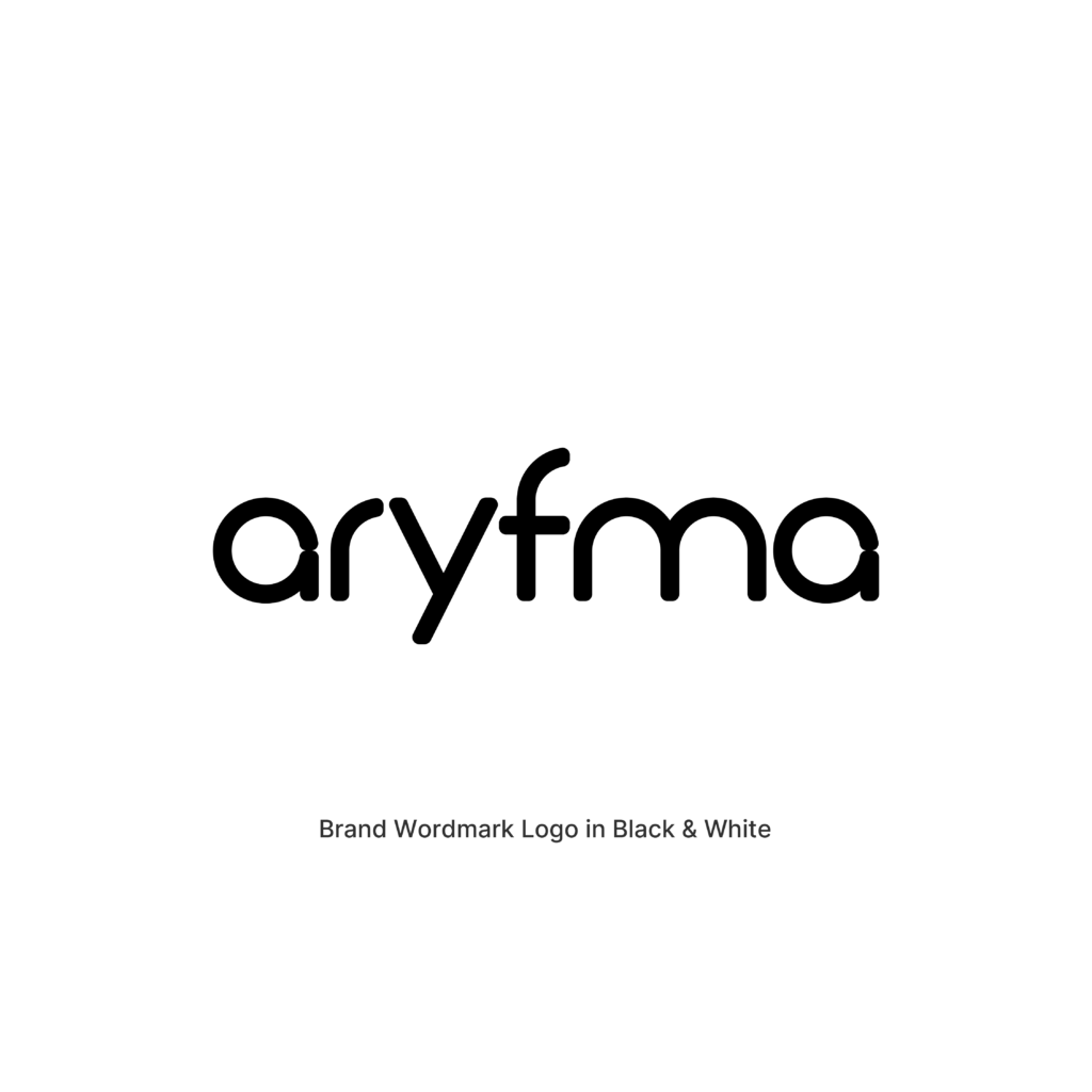
The custom wordmark is developed from the same geometric construction principles as the symbol itself. Every character is built using a consistent stroke width and rounded structure, creating a cohesive visual language that feels modern, approachable, intelligent, and highly scalable across every touchpoint.
The result is a clean and contemporary identity that communicates connection, reliability, efficiency, and long-term sustainability.
Brand Color
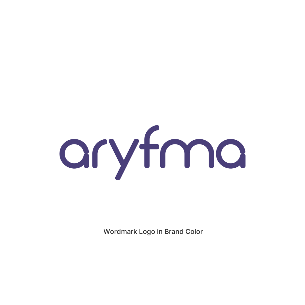
Cosmic Indigo
#4A3F7A
Inspired by clarity, confidence, and peace of mind, Cosmic Indigo represents stability within complexity.
Positioned between the worlds of technology and humanity, the color communicates trust, intelligence, security, and thoughtful innovation.
Unlike brighter technology blues that emphasize speed and disruption, Cosmic Indigo evokes a calmer and more mature confidence—reflecting ARYFMA’s role as a dependable ecosystem that quietly manages complexity behind the scenes.
The color reinforces the concept’s central theme:
Peace of Mind.
The confidence that everything is connected.
The confidence that everything is working.
The confidence that the business continues to move forward.
Strategic Meaning
- Inspired by ARYFMA’s complete business ecosystem
- Represents interconnected software, hardware, services, and people
- Uses a custom lowercase a as a symbol of unity and continuity
- Features a subtle anti-clockwise motion representing time returned
- Communicates efficiency, trust, reliability, and scalability
- Reinforces ARYFMA’s “one partner for everything” philosophy
- Positions ARYFMA as a complete business operating system rather than a standalone POS solution
Emotional Outcome
Peace of Mind
Business owners should not have to spend every moment worrying about what is happening inside their business.
They should not have to constantly check inventory, monitor staff, verify transactions, or solve operational problems.
ARYFMA exists to create confidence.
Confidence through visibility.
Confidence through connection.
Confidence through intelligent systems.
By bringing every part of the business into one connected ecosystem, ARYFMA helps owners move from constant oversight to complete clarity.
The result is not simply efficiency.
The result is peace of mind.
A business that continues to work, grow, and succeed—even when the owner is not there.
Concept C2 — Refined Ecosystem
From Digital Softness to Confident Precision
Following the selection of Concept C – One Connected System, the next stage of the process focused on refinement rather than reinvention.
The objective was simple:
How can the chosen concept become even more memorable, more versatile, and more representative of ARYFMA’s role as a complete business ecosystem?
While the original concept successfully communicated continuity, connection, and peace of mind through its fully rounded construction, this refinement introduces a subtle but meaningful evolution.
The geometry has been carefully adjusted by reducing the corner radius throughout the symbol and custom wordmark.
Although visually understated, this refinement creates a noticeable shift in character.
The identity now feels more structured, confident, and purposeful while preserving the warmth and approachability that made the original concept resonate so strongly.
The softened corners continue to communicate accessibility and human-centered design, while the tighter radii introduce a greater sense of precision, reliability, and professional craftsmanship.
The result is a visual language that feels equally comfortable in both digital software environments and physical business hardware.
This refinement also creates a stronger visual relationship with the industrial design language commonly found in modern POS terminals, payment devices, scanners, touch-screen interfaces, and other professional business equipment.
Rather than appearing purely software-oriented, the identity now naturally bridges both worlds.
Software and hardware.
Digital and physical.
Business and people.
One connected ecosystem.
The continuous circular movement remains unchanged, preserving the concept’s most important story:
Time returned.
The subtle anti-clockwise motion continues to symbolize the reduction of operational complexity and the restoration of valuable time to business owners like Anvar.
Not simply saving time.
Returning it.
The refined proportions also improve clarity at smaller sizes, strengthening recognition across mobile applications, desktop software, POS terminals, printed materials, signage, and future hardware integrations.
Why This Refinement Matters
The strongest identities are rarely transformed through dramatic change.
They are strengthened through thoughtful precision.
Every adjustment in Concept C2 has been made with one objective:
To ensure that the chosen direction feels even more timeless, balanced, and inevitable.
Rather than introducing new symbolism, this refinement enhances the existing narrative by allowing the visual language to better reflect ARYFMA’s position as a mature, dependable, enterprise-grade business ecosystem.
Emotional Evolution
Confidence
The original concept introduced Peace of Mind.
This refinement builds upon that foundation by introducing an additional emotional quality:
Confidence.
Confidence that every part of the business is connected.
Confidence that every transaction is accurate.
Confidence that inventory, suppliers, staff, and customers operate together as one intelligent system.
Confidence that the business continues to perform—even when the owner steps away.
For Anvar, confidence means trusting the system enough to spend less time managing operations and more time living life.
The softer geometry reminds us that ARYFMA is designed for people.
The refined precision reminds us that those people are running serious businesses.
Together, they create an identity that feels approachable without sacrificing authority.
Not loud.
Not complicated.
Simply dependable.
A connected ecosystem designed to quietly do its job—so business owners can confidently focus on everything else that matters.
Cosmic Indigo
White